Case Study
TellMe
Complete design and development for a social support platform.
Visit site
The project
TellMe ("Розкажи мені") is a social support platform offering free psychological consultations online. Its promise is deliberately plain: support is nearby, and reaching out costs nothing.
The context it was built for matters. Rapid change in the economy, in society and in individual lives leaves people needing help they did not plan for and cannot budget for. The barrier is rarely availability of a specialist. It is the distance between deciding you might need help and actually asking for it, and almost everything in a typical service website makes that distance longer: pricing pages, intake forms, account creation, and a tone that asks the visitor to describe their problem before it offers anything.
What we did
DForce delivered complete design and development.
- A calm, low-pressure product experience for a sensitive context. Visual language, pacing and copy are all tuned to lower the temperature rather than to drive urgency, which is the opposite of standard conversion design.
- A clear path from arriving on the site to getting help, with the shortest possible distance between the first screen and the request. Every step removed from that path is a person who did not give up partway.
- A Ukrainian-language single-page application, fast on a phone, since this is a decision people make alone and usually not at a desk.
- Accessibility-minded design, so support is reachable for people in different states and on different devices.
Engineering notes
- Conversion design, inverted. The usual toolkit - urgency, scarcity, social proof, insistent calls to action - is actively harmful here. The design problem was reassurance, and reassurance is quieter than persuasion.
- "Free" has to be believed, not just stated. If a visitor suspects a paywall further down, they leave at the first screen, so the absence of cost is carried through the whole flow rather than announced once.
- Mobile-first for a private moment. The realistic context is a phone, alone, possibly late at night, so the experience is built for that rather than for a desktop demo.
- Restraint as a technical decision. Fewer moving parts means fewer ways for the page to fail for someone who is not going to try twice.
Highlights
- "Free" positioning that puts access first
- Trust- and care-driven UX for a mental-health audience
- A full product delivered from design through development by one team
Services: Product, Design, Engineering. · tellme.com.ua
What we did here
Other work worth a look
ItSeems
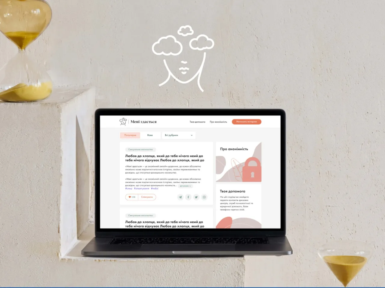
Design and development for an anonymous psychological support platform.
Ukrainian World Congress
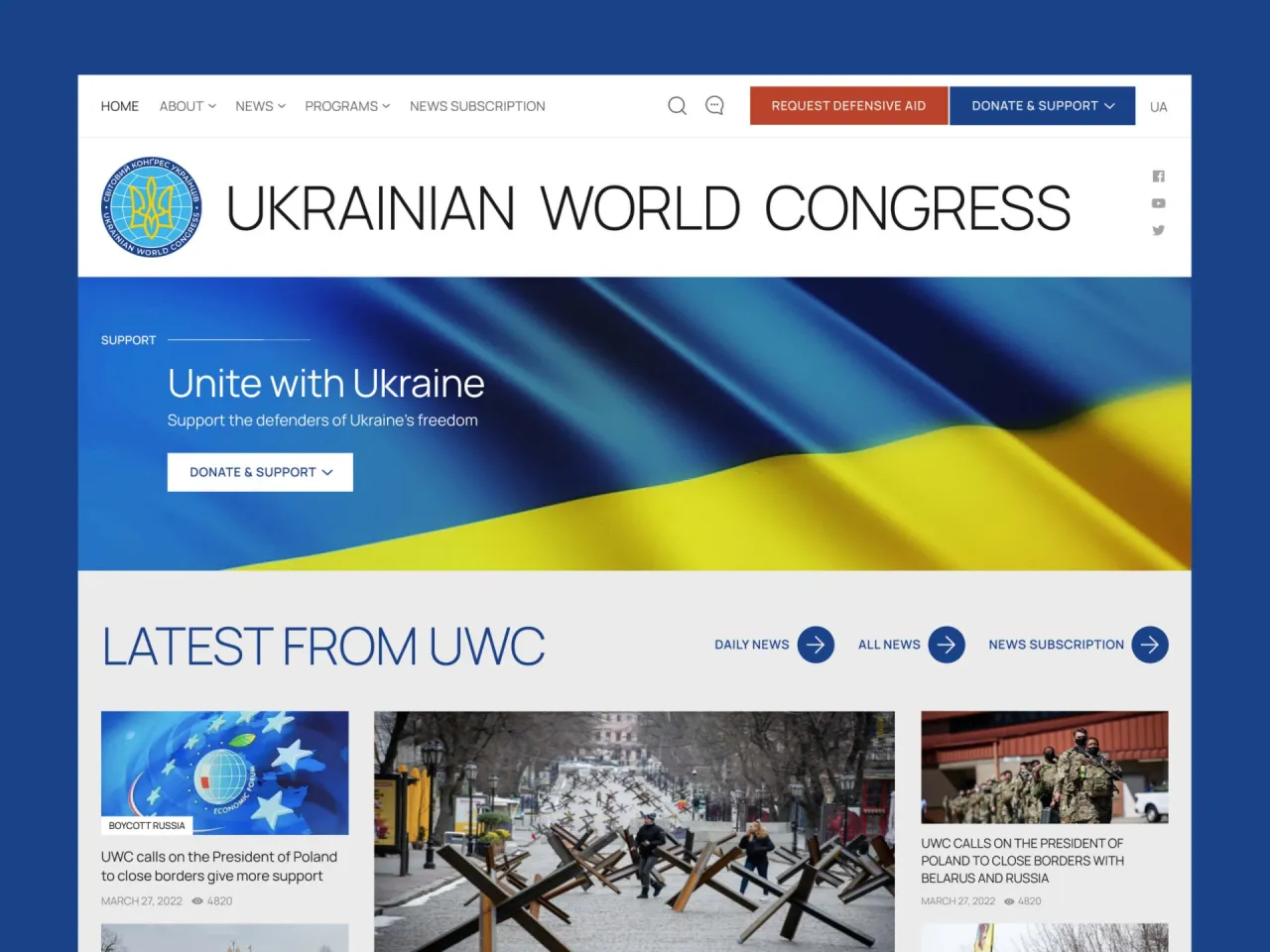
External IT & design department for global Ukrainian initiatives.
Global Ukrainian Summit 2026
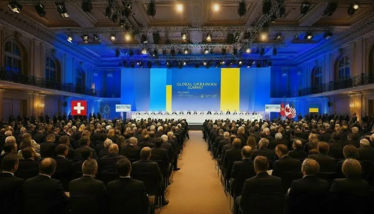
Event website for an international forum of Ukrainian community leaders and partners, held in Bern, Switzerland.